Facebook Adds Timelines for Brands
 There’s a lot of buzz about Facebook’s roll out of timelines for brands. ReadWriteWeb has a good write up here. Also, the good folks at Direct Message Labs sent out an email today describing the new Facebook page timelines for brands. Instead of trying to summarize, I figured I’d just quote the email in its entirety.
Yesterday Facebook announced that the Timeline for Brands format would be rolled out during March. The changes to the page experience on Facebook will be significant but we believe very positive for brands and their consumers. In particular, the visual representation of the brand is greatly improved throughout the experience from top image to posts. To provide some perspective on the changes, here are the items that we believe will be most important and relevant to you.
Layout of the Page
The Timeline format offers a large initial image. To marketers this is a blessing. A large image provides a strong branding opportunity which can be changed out frequently to represent the latest marketing campaign or activities of the brand (not direct promotions). We encourage you to think about this in the same way as changing out the imagery on the home page of your site.
Three Highlighted Tabs
The running list of tabs down the page is changing to now highlight three tabs visually just below the top image. Brands now have the tools to visually call out the most important tabs but must choose carefully which ones to showcase. To access others the user uses a drop down box. New icons (111×74 pixels) will be required for the tab icons.
No Default Landing Page
Many brands use the default landing page to control the initial experience of the user on the page. In the new format the landing page goes away and this puts even greater emphasis on your choice of top image and the tabs that you choose to highlight. This is particularly true for new marketing campaigns where your overall messaging should now include the app, the top image, the tab image, Facebook ads and highlighted posts (see below).
Highlighted Posts
Brands now have the ability to “pin” specific posts to the top of the Timeline for up to a week. The highlighted post will remain above all other content and is a great way to ensure that the messaging you feel is most important receives the most attention.
Expanded Tab Content
The 520 width pixel restriction has been changed to 810. This provides plenty of new real estate to expand the consumer experience. Fortunately, old applications will be centered in the tab so that you can continue to provide the same experience to users as before.
Check out some brands using the new Timeline effectively:
Coca-Cola
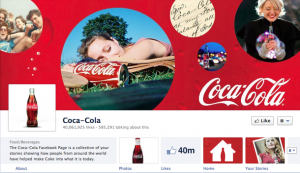
Coca-cola uses the new Timeline to highlight Coca-Cola’s history all the way back to 1886. This is a unique and interactive way to share the brand’s history with customers.
Red Bull
Red Bull launched a Red Bull Timeline Timewarp game-sweepstakes to celebrate the new page. The game is a scavenger hunt that has participants find the answers to clues on the brand’s new timeline page.
Livestrong
Livestrong uses its signature colors of black and yellow to create a cohesive look across the thumbnail, cover and tab images.
Starbucks
Starbucks takes advantage of the way photos post on the new Timeline, sharing a variety of photos and pairing them with conversation pieces such as fill-in-the-blank statuses.


